There are different ways of creating visualizations in R, including built-in functions (base R). However, in this tutorial, I am going to focus on ggplot2 functions, which are a part of the tidyverse univese.
ggplot
The ‘formula’ for ggplot2 is simple. For example, if we want to create a bar graph, the code will look something like below
ggplot(dataset, aes(x=variablex, y=variabley, color=variablez)) +
    geom_col() +
    labs(x = "X label", y = "Y label", title ="Add a title above the plot") +
    theme_bw()
You always start with ggplot, which is the function and put the name of the dataset as the first element. Then specify your x and y inside aes(), which stands for aesthetics. You may add other parameters such as color, shape, and fill. Then you can ‘build on’ using + signs.
There are different functions that create different type of graphs: geom_point() for scatter plots, geom_line() for line graphs, geom_col() for bar plots, geom_histogram() for histograms. Please refer to ggplot cheat sheet. for a more comprehensive list.
After you’ve specified the variables and the type of graph, you can customize it further: add extra lines, provide labels, change the themes, etc.
⚠️ Your name of dataset and variables have to MATCH EXACTLY how you’ve saved them. Capitalization matters! ⚠️ Remember to close all the parentheses, and do NOT forget the little commas.
Here is some real code for you to play around with ggplot! We are going to use the nycflights13 package again for data.
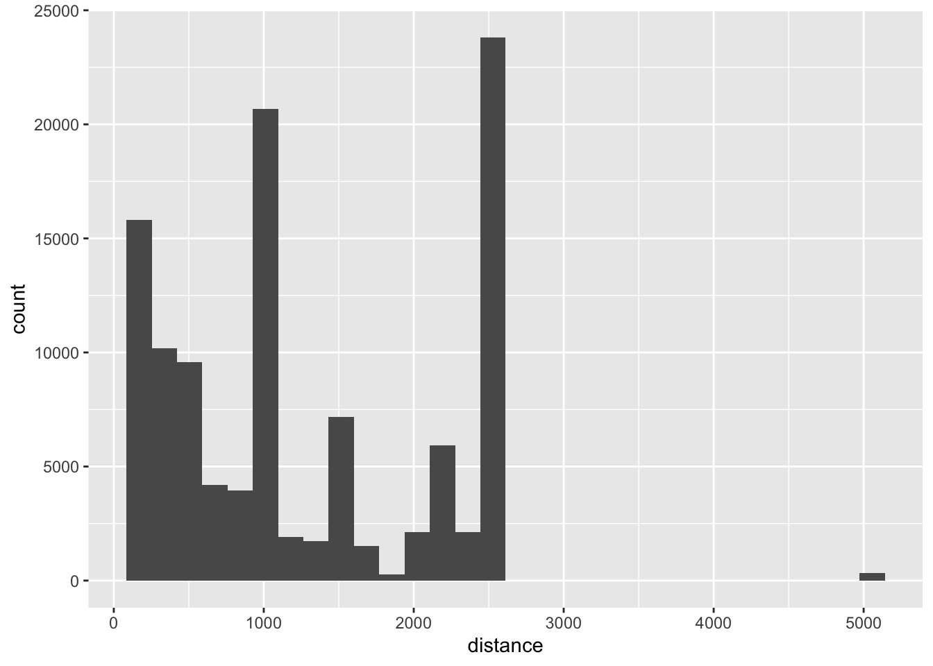
#loading packages#install.pacakges("nycflights13")library(nycflights13)library(tidyverse)dta <- flights # let's assign the flights package to an object named dta so it can show in the environment# We are now only going to look at flights from JFK. ori_jfk <- dta %>%filter(origin =="JFK")## histogram ggplot(ori_jfk, aes(x = distance)) +geom_histogram()
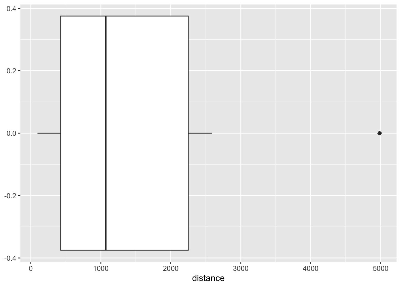
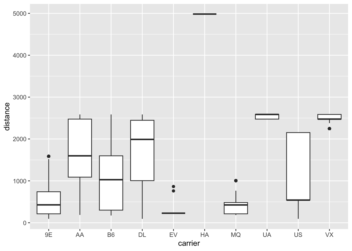
## boxplot - bivariateggplot(ori_jfk, aes(x= carrier, y = distance)) +geom_boxplot()
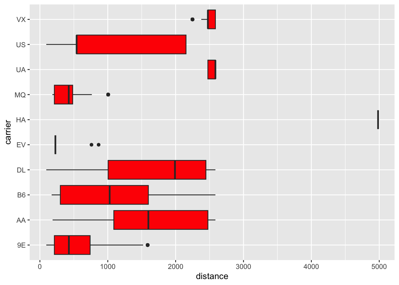
ggplot(ori_jfk, aes(x= carrier, y = distance)) +geom_boxplot(fill="red") +# Give it some colorcoord_flip() # This flips x and y axis
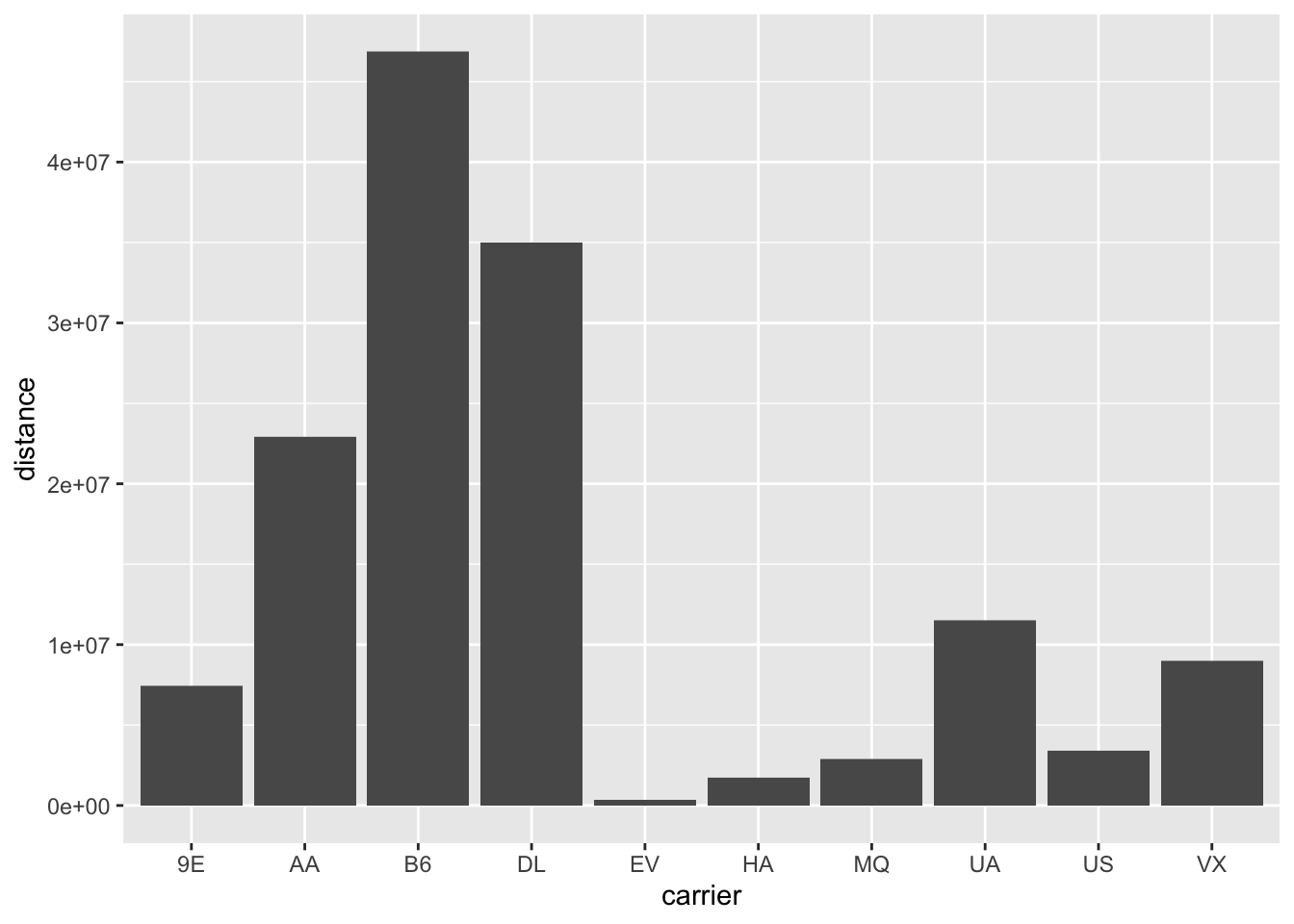
## bar graph ggplot(ori_jfk, aes(x= carrier, y = distance)) +geom_col() # Note that X is categorical
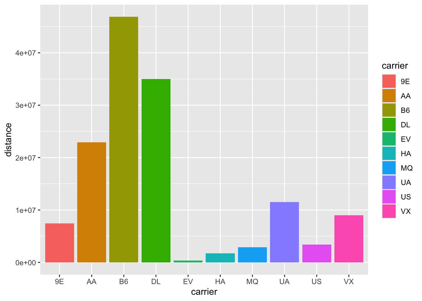
ggplot(ori_jfk, aes(x= carrier, y = distance)) +geom_col(aes(fill = carrier))
ggplot(ori_jfk, aes(x= carrier, y = distance)) +geom_col(aes(fill = carrier))
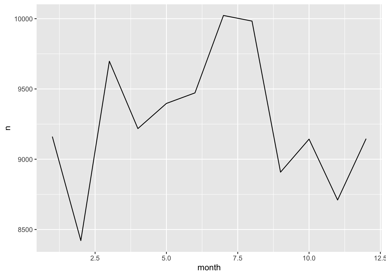
## line graph ## Recall that line graph shows trend over timedta1 <- ori_jfk %>%group_by(month) %>%tally() # a little of data wranglingggplot(dta1, aes(x=month, y = n)) +geom_line()
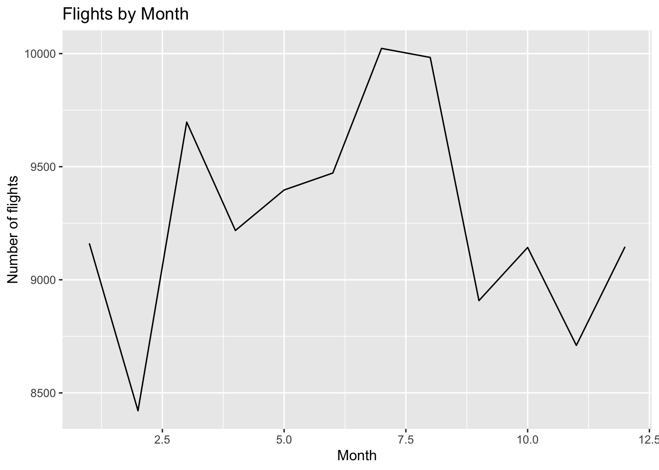
ggplot(dta1, aes(x=month, y = n)) +geom_line() +labs(x ="Month", y ="Number of flights", title ="Flights by Month") # Labeling is an important part of making graphs!
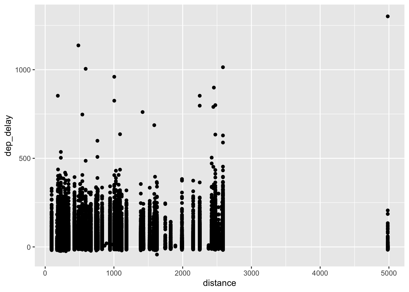
## scatter plot ggplot(ori_jfk, aes(x=distance, y = dep_delay)) +geom_point() # Note that both X and Y are continuous
Warning: Removed 1863 rows containing missing values or values outside the scale range
(`geom_point()`).
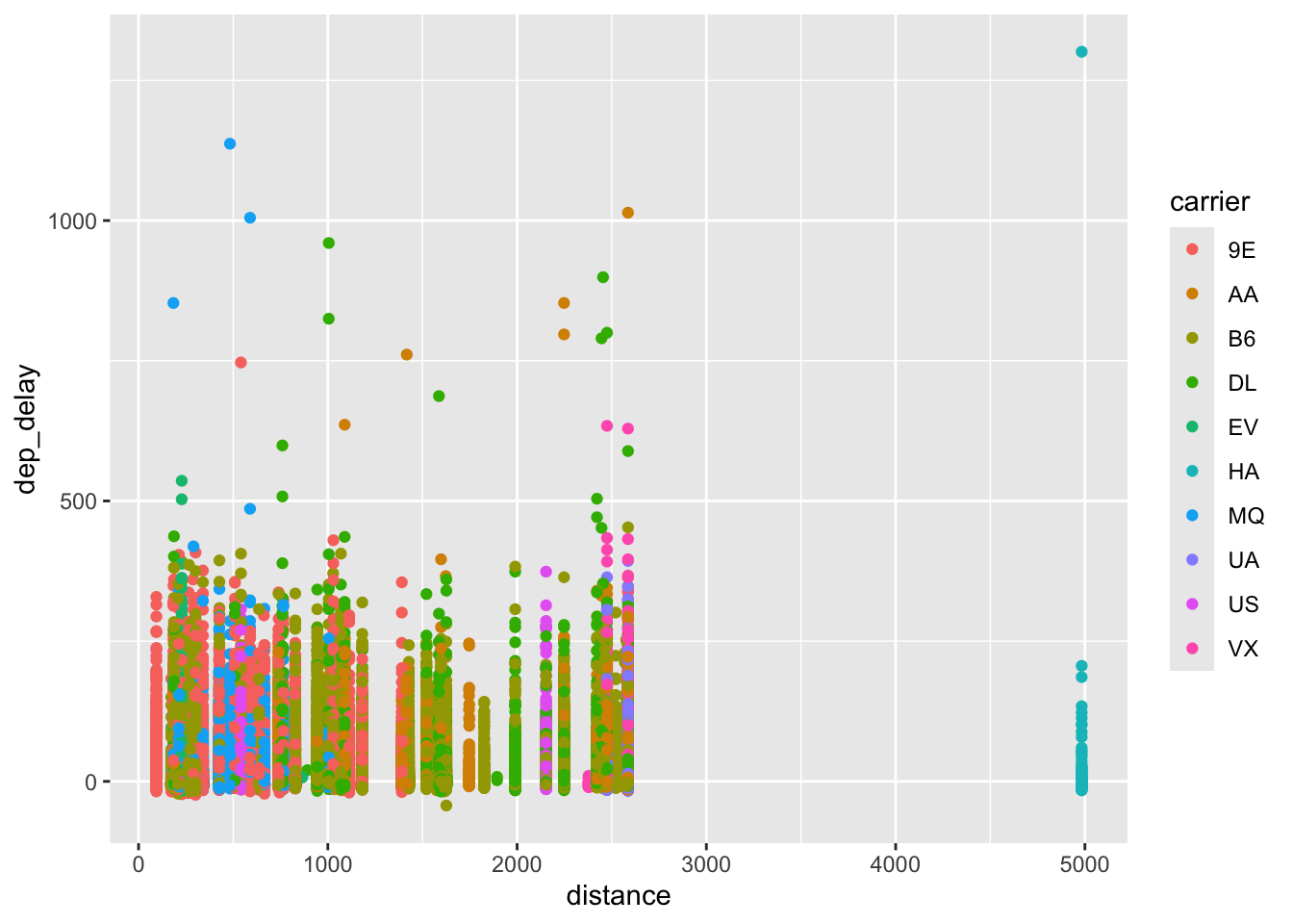
ggplot(ori_jfk, aes(x=distance, y = dep_delay, color = carrier)) +geom_point() # You can color them by carrier
Warning: Removed 1863 rows containing missing values or values outside the scale range
(`geom_point()`).
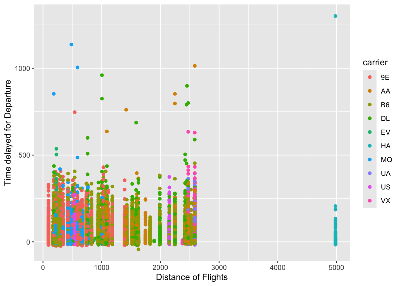
ggplot(ori_jfk, aes(x=distance, y = dep_delay, color = carrier)) +geom_point() +labs(x="Distance of Flights", y ="Time delayed for Departure",titlte ="Departure Delays and Distance") # Giving it a label
Warning: Removed 1863 rows containing missing values or values outside the scale range
(`geom_point()`).
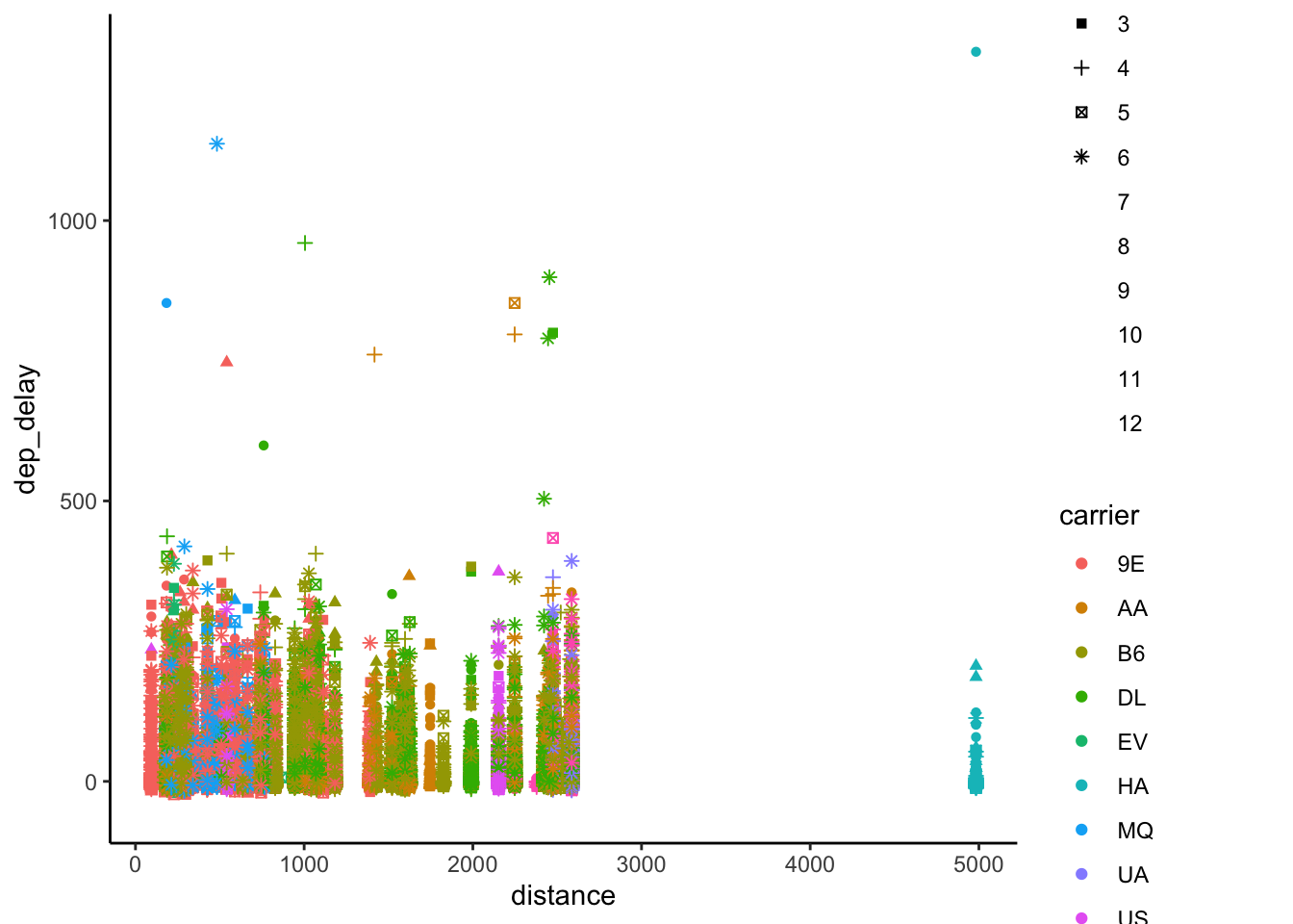
ggplot(ori_jfk, aes(x=distance, y = dep_delay, color = carrier, shape =as.factor(month))) +geom_point() +theme_classic() # You can also change shapes of dots too!
Warning: The shape palette can deal with a maximum of 6 discrete values because more
than 6 becomes difficult to discriminate
ℹ you have requested 12 values. Consider specifying shapes manually if you need
  that many have them.
Warning: Removed 57126 rows containing missing values or values outside the scale range
(`geom_point()`).
You can save these beautiful graphs. But before you save, make sure you have the working directory correctly set. (Or at least where it is set as. You can check your working directory with getwd() function.)
After you’ve created a ggplot figure, run below code. You can change the file name within the quotation marks, and swich around the dimensions. You can save a figure as a png, pdf, jpeg formats.
ggsave("viz1.png", width = 4, height = 4)
Section 4 Task:
Below is a set of assignments that you can try on your own. The answers are below the questions, but I highly encourage that you try to answer the questions on your own without looking at the solutions.
Let’s continue to use the “flights” dataset from the from ‘nycflights13’ package.
Create a subset of data with destination to SFO.
Hint 1: Use ‘filter’ function.
Answer:
dest_SFO <- dta %>%filter(dest =="SFO")
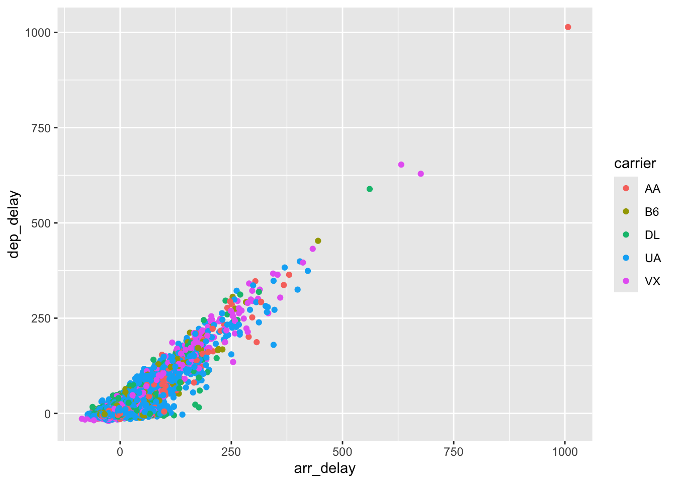
Plot the relationship between the arrival delay and departure delay, and color the points by carrier.
Hint 1: Use geom_point to create a scatterplot.
Hint 2: Put ‘color = carrier’ inside the aes().
Answer:
ggplot(dest_SFO, aes(x= arr_delay, y = dep_delay, color= carrier)) +geom_point()
Warning: Removed 158 rows containing missing values or values outside the scale range
(`geom_point()`).